
22 author website examples to inspire you

As you’d expect, I have spent a LOT of time looking at author websites. And I genuinely love it. Seeing all the amazing creative ideas that authors have for their websites lights me up.
You don’t need to have a boring author website! Authors are honestly the most interesting people I ever meet - with rich inner lives - and bringing some of your personality to your author website is ALWAYS a good thing.
The definitive guide to building your own author website →
However, I know that when it comes to building your author website, you might not know exactly where to begin.
So in this post I’m sharing 22 of my favourite author websites with you, to hopefully inspire you when it comes to your own author website.
These websites are listed in no particular order - they are just websites I’ve come across during my work and kept a note of as they impressed me.
I have only taken screenshots of the homepages, but please do read the notes I’ve made below each, as often there are great ideas hidden in the other pages too.
Top tip: click on the images to be taken directly through to see the live version of the author’s website!
You might also notice that I haven’t included any of my own author website designs!
That felt a bit too salesy for a blog post, and I genuinely love looking at other web designers’ work, but if you want to see some of my designs, you can take a look at my Portfolio here 😊
Also, not all of these sites are built on Squarespace - but that’s still my recommend platform for authors.
1) Kate Hewitt’s author website

Notes on Kate Hewitt’s author website:
Great use of colours and fonts - inviting but clear design - although there are quite a few of them, all the colours work well together
Kate is a prolific author but her website showcases all the books well
The ‘Get Involved’ tab encourages readers to join her Facebook group and follow her on Substack and is nicely intriguing
Top tip: think of a way to get your readers involved in your writing journey, either through joining a Facebook group or signing up to your newsletter.
2) Freda Lightfoot’s author website

Notes on Freda’s author website:
Striking visuals grab you straight away & put you right into the era of Freda’s books
I love the clear navigation so you can easily find what you need
There are prominent links to buy the books!
Cohesive design with the blue running throughout the site - less is more, colour wise!
Top tip: Make use of evocative photography that immediately conjures up the mood of your books.

3) Sharon Blackie’s author website

Notes on Sharon’s author website:
Amazing first image to draw you in
Cohesive colour scheme
Clearly delineated sections on the homepage
Neutral backdrop to show off the books’ covers - make sure the backdrop to your covers doesn’t fight with them
Two calls to action to follow Sharon on Substack
Lots of information across the website but very well organised so not overwhelming
Top tip: Break up the content on your homepage by using different coloured backgrounds.
4) Taylor Jenkins Reid’s author website

Notes on Taylor’s website:
My favourite author website (possibly!)
Clear layout, beautiful, fresh, inviting colours
Cohesion throughout the pages with Taylor’s name prominently displayed on each page
Not too much scrolling so it’s not overwhelming
Latest book takes centre stage
Announcement bar to encourage newsletter sign ups
All the info you really need is on the homepage - efficient use of space
Top tip: lots of people who visit your website won’t get past the homepage - make sure ALL the important info they need is there.
5) Anna Mazzola’s author website

Notes on Anna’s website:
Immediately aware what genre we’re in from the design
Simple, less is more, approach
Prominent call to sign up for Anna’s newsletter
Interesting blog section - called ‘Articles’ - with enticing images and headlines. Blog content is well organised with sub headings
Top tip: if you do choose to blog, make the most of free image libraries like Unsplash to bring your blog posts to life.
6) Alexis Hall’s author website

Notes on Alexis’ website:
Dynamic elements bring the design to life
Fun graphics and tone of copy to echo the books’ themes
Useful FAQ section - great for an author with an extensive backlist
Prominent social media icons at both the top and bottom of the homepage
Intriguing and engaging website that I find very ‘sticky’ - it makes you want to keep clicking!
Top tip: An FAQ section is a great idea for your author website - not only will it field any annoying queries you get asked all the time, it’s also a nice way to introduce a bit more information about yourself and your writing.
7) Emma Flint’s author website
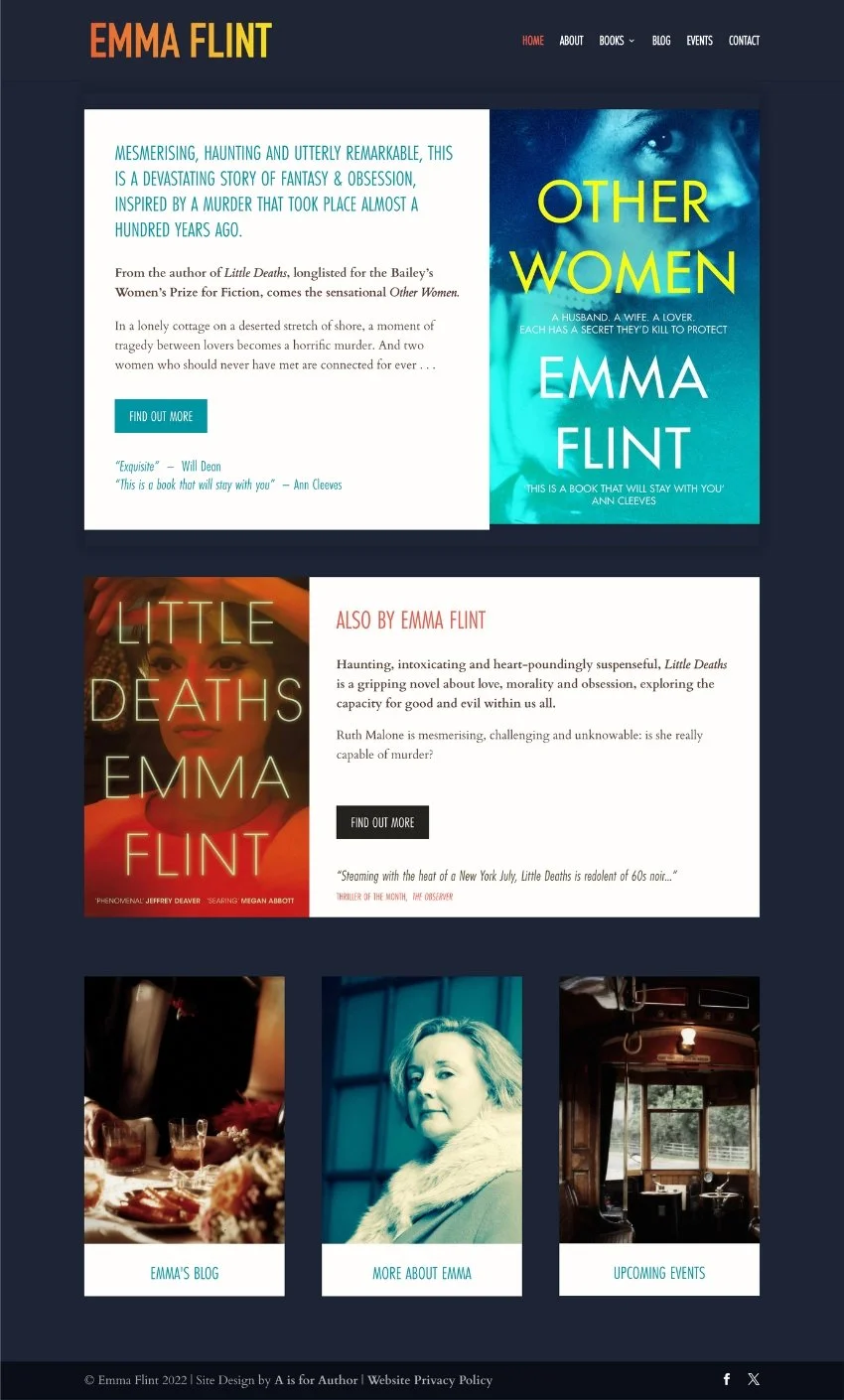
Notes on Emma’s website:
Simple, clear design - I really like it!
Again, follows my ‘less is more’ rule!
Colours and fonts chosen complement her books’ covers
Dark background means content displayed in lighter boxes stands out
Top tip: when it comes to fonts, less is more. Choose fonts that align nicely with the fonts used on your books’ covers. They don’t have to match, but make sure they sit well together.
8) JoJo Moyes’ author website

Notes on Jojo’s website:
It’s worth mentioning that this website is run by Jojo’s publishers, proving that when you become a ‘big name’ your publisher will do this kind of thing for you!
Because she’s so well known, her name takes centre stage, with bespoke London skyline running along the bottom of the top banner
However, I do personally think the book covers are a little lost in this design - could definitely be bigger!
Also, the rotating banner is old fashioned - studies have shown that they are not very effective, so I wouldn’t recommend them
The website has some nice design elements but there’s not much there to entice readers - could offer some extra content
Why you don’t want a rotating banner on your author website →
Top tip: illustrative elements can really bring a design to life. Ask your publisher if their art team can provide you with any small details they might have used on your cover to sprinkle throughout your website’s design.
9) Sarah Vaughan’s author website

Notes on Sarah’s website:
Clean and simple design with a cinematic feel
Uses highlights from the Netflix adaptation of Sarah’s book to draw instant recognition
Prominent pull quote for Sarah’s latest book on the header image
Equal weighting to both US and UK editions
Lots of call to actions!
Deep footer with more call to actions
Top tip: if you’re in doubt about what colours to use on your author website, then a simple black background can be very effective. Especially if you write thrillers.
10) Colleen Hoover’s author website

Notes on Colleen’s website:
Big, busy website for an author with a LOT going on
Feels much more like a business website than an author’s website - Colleen is a BRAND
Immediate call to action to buy signed copies of Colleen’s books (love this as an idea - please offer this to your readers if you can)
Banner displaying ALL of Colleen’s massive backlist
Trailer for the film of It Ends With Us (but of course!)
Colleen also has MERCH! (so do I! 😆)
Top tip: want to make money from your author website? There are several ways you can do this! Take a look at my blog post here for one simple idea.
11) John Grisham’s author website

Notes on John’s website:
Another website set up by the publisher - John Grisham is a big brand!
Love the banner with all his book covers knocked back so that his face can appear in front of them - gives the impression of gravitas
Prominent link to pre-order new book
Neat books landing page with all the covers - but no retail links unless you click through, which I think is missing a trick
Homepage divided into clear sections with simple calls to action
Top tip: if design is not your thing, there’s no shame in going safe. John’s website isn’t particularly exciting visually, but it’s clear and does the job.
12) Katie Khan’s author website

Notes on Katie’s website:
A long scrolling homepage but beautifully designed with all the info you need
Monochrome designs can look so classy
Love the dynamic elements - including Katie’s author signature
Love that Katie’s newsletter has its own branding and title: ‘notes from the near future’ - be creative with your newsletters, people!
Sophisticated and comprehensive design that ticks all the boxes
Top tip: photoshoots can be expensive but they’re an investment! If you can afford it, have some proper pictures taken for your author website - it will really bring it to life and make it look so much more professional.
13) Nita Prose’s author website

Notes on Nita’s website:
Striking homepage featuring all of Nita’s books
Bold book covers offset nicely by the dark background - with interest added by the geometric border, which gives a hint of the genre/world of her books
Love that the background changes to white on the other pages (it’s harder to read white text on a black screen for most people)
Not sure what the point of the publishers page is (I would probably rename it Editions), but great to see downloadable kits for bookclubs
Top tips: don’t forget bookclubs! Providing extra material for readers on your author website is always a really nice touch - like Nita does with her downloadable Bookclub Kits.
14) Kate Morton’s author website
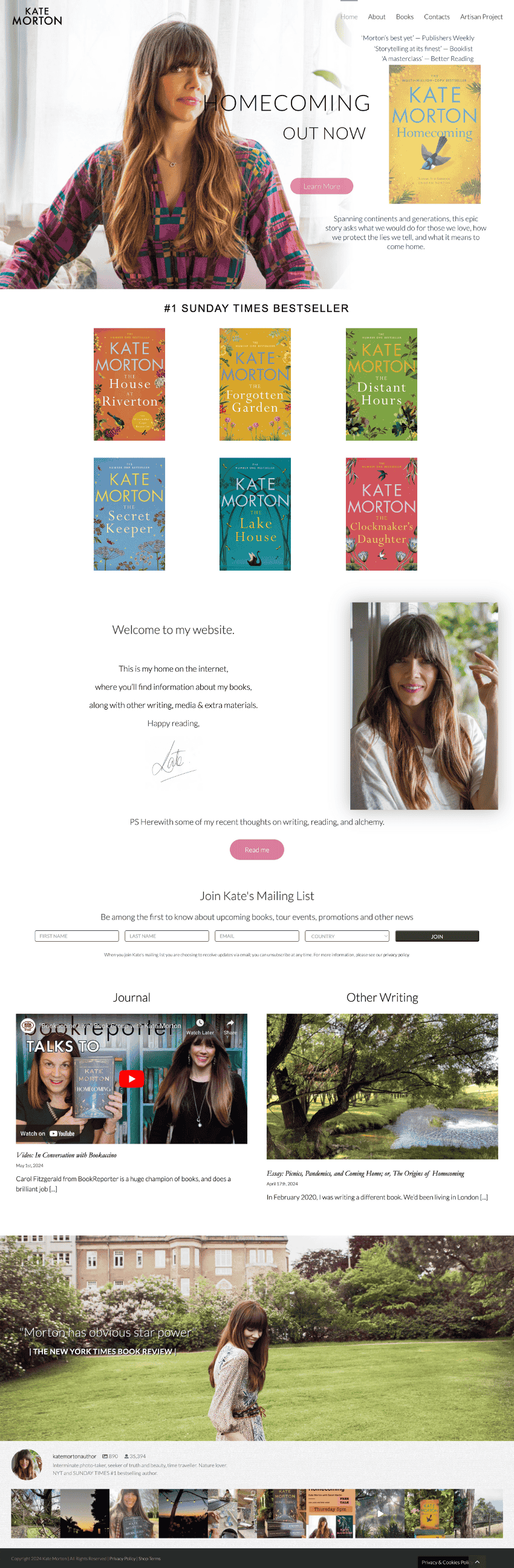
Notes on Kate’s website:
Gorgeous author photos set the scene (although the title of her latest book went over her face on my screen - so do take care when overlaying text on images of people as this can happen with responsive design)
Latest book is still above the fold which is great
Love the favicon too
Cute Instagram feed in the footer
Love the way the content is broken up with images of Kate
Love love LOVE the link to her artisan gift boxes - such a nice idea for a present!
Top tip: video content can be an amazing addition to your author website. Video content helps strengthen your relationship with your readers by making you seem like a ‘real’ person - meaning they’re much more likely to remember you.
15) Imogen Robertson’s author website

Notes on Imogen’s website:
Love the animated video background on the header - immediately captures the world
Beautiful buttons!! 😂 rarely do I see buttons that look so ‘designed’
Lovely use of backgrounds too to break up the content and draw the eye
Also love the font used for Imogen’s name
Each book page continues the theme with stunning photography that really captures the mood of the books
Usually I prefer ‘less is more’ on author websites, but this is one case where I think the website is extremely effective at drawing the visitor into the world
Top tip: banner images (at the top of website pages) are still a great way to create atmosphere. While generally I recommend debuts make sure their book’s cover is ‘above the fold’ of the homepage (the point at which you need to scroll down to see the rest of the website), for more established authors with multiple books, a banner image can be a great choice.
16) Kate Atkinson’s author website

Notes on Kate’s website:
Another publisher website, but SO gorgeous
Love the use of colours from the book’s covers to provide visual interest to the design
Also really like the use of graphical elements/animals to represent themes from the books - do you have something similar you could pull out and use?
Love that all of Kate’s books are visible on her homepage
Plenty of content - video, reviews, interviews
Top tip: if you have a lot of content on your author website, take a while to ‘plan’ your website and think about a visitor’s journey through the site, so that you are not dumping it all on the homepage. This can be overwhelming. Try to develop a ‘path’ through the website that feels logical and satisfying for a visitor, and ensures they get to see all of your content without being bombarded.
17) Rebecca Yarros’ author website

Notes on Rebecca’s website:
Lush, bold homepage design
Love her illustrated name
Very friendly ‘About Me’ page, perhaps recognising her younger readership - remember who your readers are when you put together content for this page
Very active on social media - lots of calls to join in - Fly Girls Facebook group, building her own community
Get the impression that she wants to hear from readers
Top tip: at all times when building your author website, think about your READERS! Who are they? What are they like? What kind of tone of voice would they respond to? Keep this ‘reader profile’ in mind when you start to prepare the content for your website.
18) James Clear’s author website

Notes on James’ website:
Love this design, so simple and clear (ha!)
Lots of white space draws attention to the important things
Tagline ensures you are immediately aware of what James’ book is all about
Different pop-ups on different pages
Not much to say really - the design stays out of the way of the content, which I love
Top tip: you can never really have too much white space on a website! It allows content to breathe. Don’t be afraid of using it.
19) Brad Thor’s author website

Notes on Brad’s website:
Brad has a logo - not something I would advise for debut authors as your author name is your brand so you need to get it out there as much as possible
Another website with a rotator (boo!) - however it’s slow moving, giving you enough time to take in each banner, so I don’t completely hate it!
Bold use of photography behind each book to conjure up the scene
His logo in the favicon looks like the American flag - deliberate?!
Brad offers an ‘ultimate reader experience’ - offering playlists, food and drink recommendations and even travel suggestions related to each book - if you sign up to his newsletter
He also has a shop! Hurrah! Only the second one I’ve seen
Feel like Brad really sees his author brand as a business beyond the books
Top tip: get creative with the extras you offer visitors to your author website! Playlists to accompany reading the book, travel tips, behind-the-scenes research… all this stuff is really interesting and valuable to your fans, so don’t be afraid to share it.
20) Rupi Kaur’s author website

Notes on Rupi’s website:
Design is calming and welcoming and very much ‘on brand’
Elegant use of splashes of colour and subtle illustrations
Lots of pictures of Rupi on the homepage - she is a woman who means business
Shop with lots of different products available - including tattoos! Love this idea, something to consider
Calls her newsletter ‘love notes’ (but of course!)
Has even recorded one of her poems as a music track
Top tip: overlapping images and text is always an effective way to make an impact with your design - and Squarespace’s editor, Fluid Engine makes it really easy. If you want to get a bit more creative with your designs, find out more about making the most of Fluid Engine here →
21) LJ Ross’ author website

LJ Ross' homepage
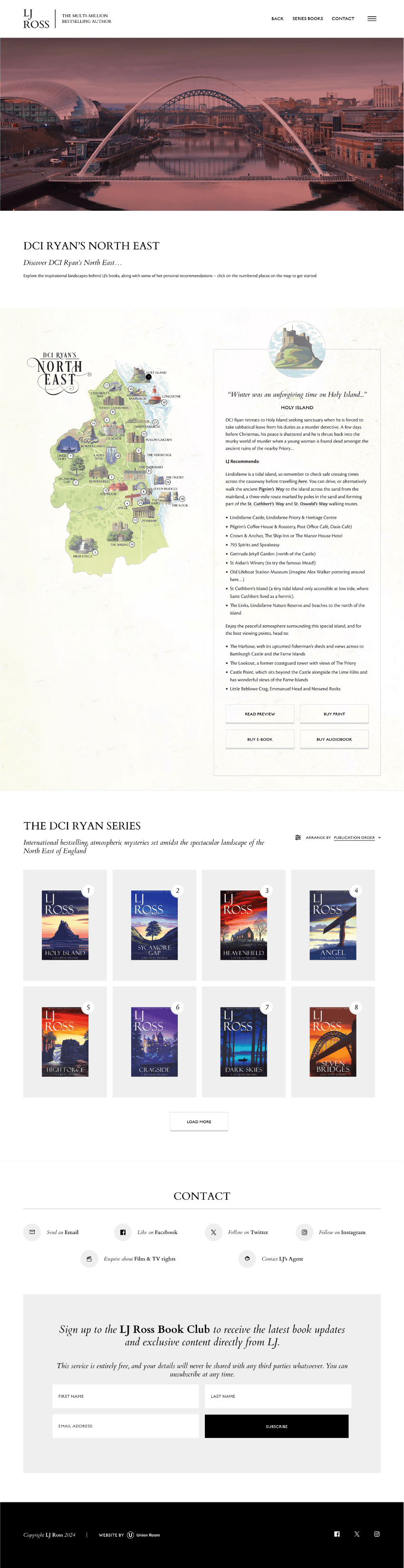
Notes on LJ’s website:
I had to share two pages of this website because the homepage is quite minimal!
Maybe not the most user friendly (simple is generally better from a UX point of view) but I LOVE this website
(Sidenote: the categories for her books remind me of different flavours of chocolate bars lined up 😆)
Navigation is hidden off the to the left - definitely encouraging you to dig straight into the book series you’re interested in rather than anything else
Prominent call to sign up to the newsletter
Classy, elegant with lots of bonus content including beautiful illustrated maps
Use of animated headers too
An expensive-looking, comprehensive website for an extremely successful author
Top tip: if you write series, consider including character summaries for your main characters. You could even share a pretend interview with one of them! Readers become very attached to the characters in series and will appreciate any extra info like this.
22) Jennifer Egan’s author website

Jennifer's homepage

Notes on Jennifer’s website:
Last but not least, I had to include this author website because quite frankly it’s a bit MAD
Interactive and intriguing - it doesn’t really tell me anything about the book, but hey, sometimes you can just say screw the rules I want to be creative, and if you get it right, then it’s OK!
Once you’re past the weird and wonderful homepage, the website is actually really nicely laid out, with all the relevant information you could want at hand
Top tip: if you want to go completely creative and crazy with your author website, then go for it! So long as the website loads quickly and isn’t really difficult to navigate, then feel free to let your creative muscles flex.
Conclusion
Phew! If you’ve made it to the end of this post then you deserve a medal! I hope you found it interesting - I certainly found it interesting putting it together.
I thought I’d also share some general observations about author websites I’ve had, after looking at all these examples in detail.
Here are some author website essentials, IMHO:
1) Add a pop-up to your author website!
Only a few author websites had pop-ups which proves my theory that authors are scared of seeming pushy when it comes to encouraging people to sign up to their newsletters! Why!?
Add one to your author website! They are really effective.
Should I add a pop-up to my Squarespace author website? →
2) Make sure the photography you use is high quality
The best author websites had strong, high quality images, immediately elevating the design and making it look more professional. This includes author headshots and any background photography.
It really is worth thinking very carefully about the photography you use and making sure it’s of the highest quality.
Top tips for taking your own author headshot →
How to find photos for your author website →
3) Make it easy for people to buy your books!
It sounds obvious but the number one most common mistake I see on author websites is not providing links for readers to quickly and easily buy the books.
Make sure that every page has a clear to call to action, and that whenever you post a picture of a book, there’s a link underneath for people to click through and buy.
Which retailers should I link to from my author website? →
4) Make sure your website is responsive
Luckily this is not something you need to worry about if you use Squarespcae to build your author website!
Why Squarespace is the perfect web platform for authors →
But if not, just make sure that your author website looks as good on mobile as it does on a computer, because these days more than half of all website traffic comes from a mobile phone and if your design looks rubbish on mobile, people will just leave.
Why responsive web design matters →
5) Be sure to add a mailing list
You might not want to start sending author newsletters (I get it, who has time on top of everything else you are juggling as a writer!?) but setting up a mailing list to capture readers’ email addresses is honestly one of the most important things you can do as a writer.
Why every author should set up a mailing list →
6) Don’t be afraid to add some personality!
What really stood out to me when I was researching author websites for this post was just how much more engaged I was with author websites that showed a hint of quirkiness, or a touch of personality.
While overcomplicating things is never a good idea, adding a few unusual touches can make all the difference between a flat, boring website, and something that really pulls you in and makes you want to explore more of the site.
Do you have a favourite author website you’d like to share? If so, drop it in the comments below!

Want more free advice on building the perfect author website?
Sign up below to receive all my top tips direct to your inbox!
More posts like this: